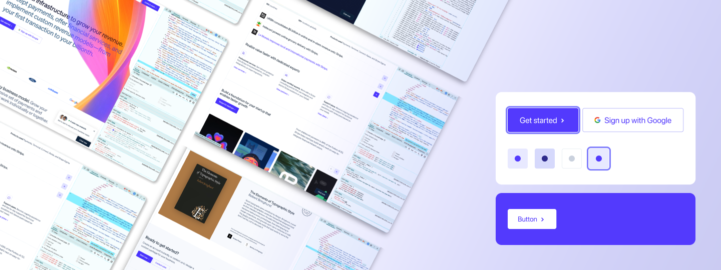
Chrome web inspection
Mac native screenshot
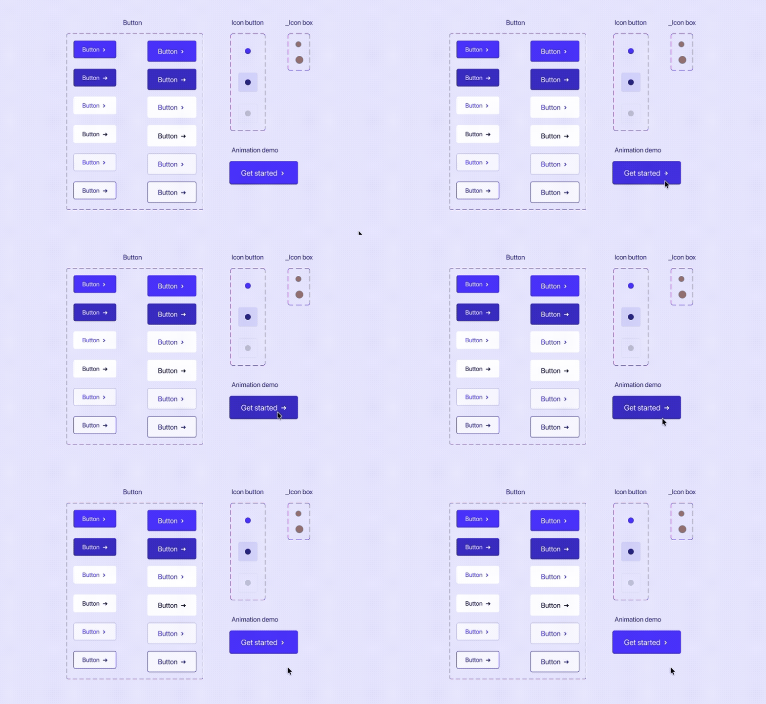
Image: final design showcase
- Button
- Icon button
- Icon box (utility)
- 3 variants
- 3 states
- 2 sizes
- 1 boolean property
- 4 states
- 2 sizes
- Instance swap property for easy use
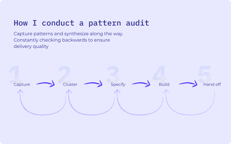
Image: my pattern audit process
2. Cluster — Drop collected patterns into Figma and group variations into candidate components
3. Specify — Analyze the properties each component needs and extract styling elements like color, typography, and spacing from web inspection
4. Build — Design, validate, and test the component
5. Hand off — Annotate and spec for engineering
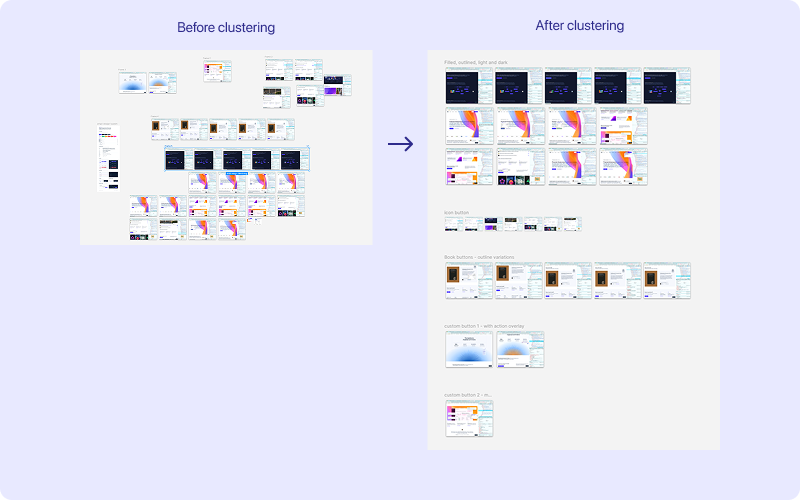
Image: before and after clustering similar UI patterns.
- Kick off AI workflows in parallel to human tasks to save time on waiting on AI responses.
- Delegate straightforward busy work to AI while you carry out tasks that need more thinking.
- Always review AI output for accuracy. In cases you can't access source code, asking it to explain its methodology like "how did you get the hex value?"
- Any 6 digit hex codes (i.e. colors with transparency) are only allowed in Figma Fill so make sure to convert to RBGA for Figma variables.
- If you see repeating colors and styles during inspection, you will most likely need a 2-tiered or 3-tiered design token structure.
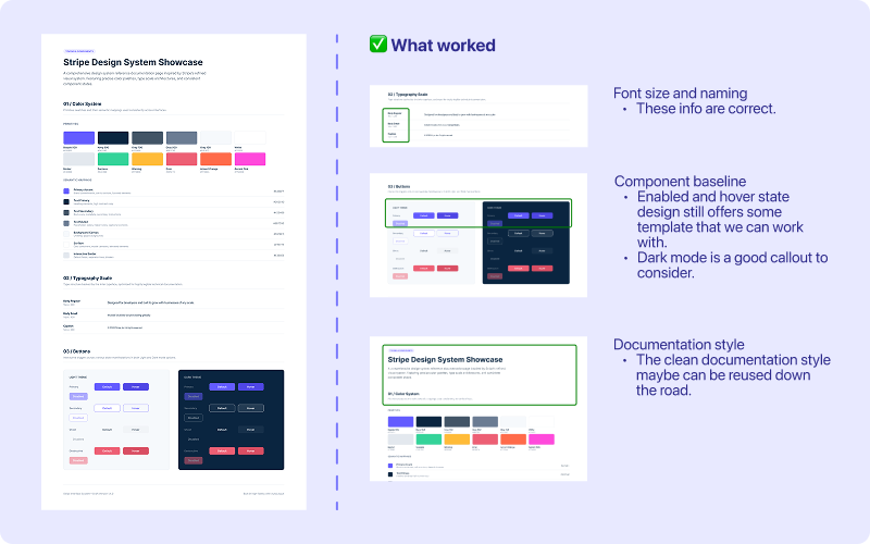
Image: AI did output the font size correct and offered some baseline for the enabled and hover states of the button.
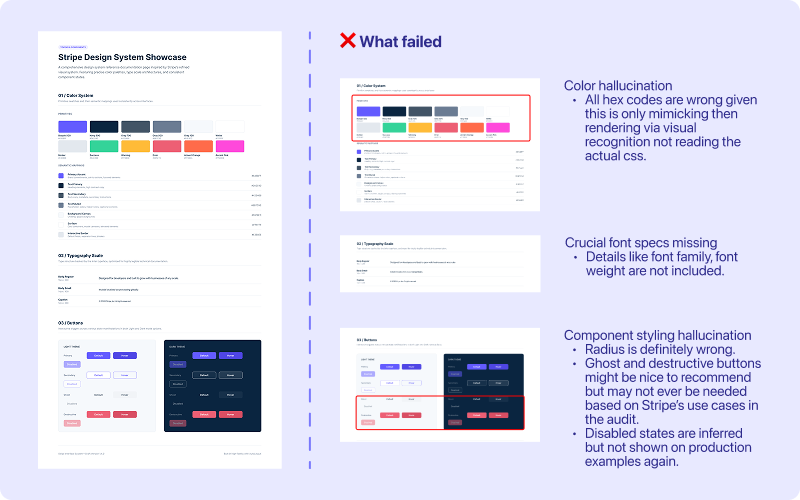
Image: AI style guide output that failed to offer accurate specs on color hex, font family or weight, and inferred unnecessary states for the Button.
- Font size and naming are correct.
- Component baseline can be reused:
Enabled and hover state design still offers some template that we can work with.
Dark mode is a good callout to consider.
- Documentation style
The clean documentation style maybe can be reused down the road.
- Color hallucination:
All hex codes are wrong given this is only mimicking then rendering via visual recognition not reading the actual css.
- Crucial font specs missing:
Details like font family, font weight are not included.
- Component styling hallucination:
Radius is definitely wrong.
Ghost and destructive buttons might be nice to recommend but may not ever be needed based on Stripe’s use cases in the audit.
Disabled states are inferred but not shown on production examples again.
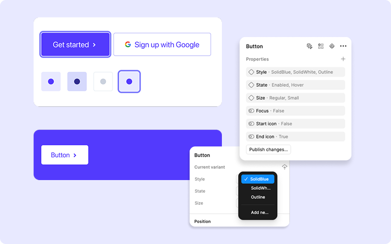
Image: testing components by checking and inspecting the properties built.
- checking for any missing Figma component properties
- inserting an instance and play with all properties permutations
- remaking a production example with the Figma draft
- focus state of the buttons were missing
- the filled buttons were missing the a hover animation on the arrow icon
- button labels were single line text rather than wrapping (so technically the button's sizing dimension token needs to be applied to Height rather than Min-height in Figma)
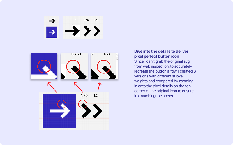
Image: diving deeper into pixel details to delivery high quality recreation of the button icon
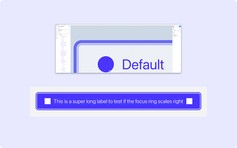
Image: zoomed in to check for design details on the focus ring
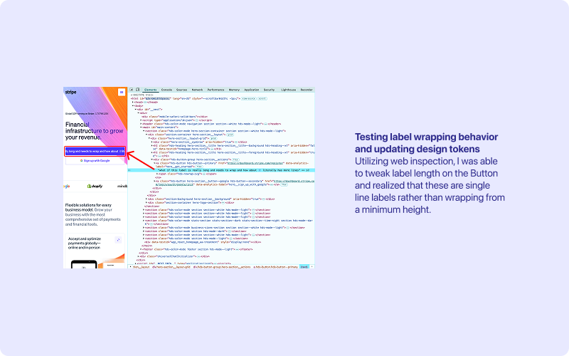
Image: long label just overflow to the side but I designed the button labels to wrap so an updated was needed
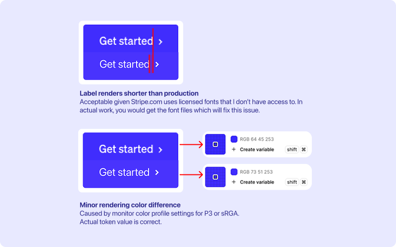
Image: rendering difference in label and color
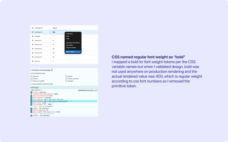
Image: remove unused tokens
Given this is a skill showcase, I only inspected the homepage on stripe.com. For work, I would look at all pages, sites, and cross-platform apps if they need to be covered by the design system as well.
Since we are only recreating the buttons, I did not bother to make a 3-tiered design token system. But I actually know Stripe's team does have a tokens file (from their previous conference talk) so in reality, I would ask devs first for the actual css file and synthesize that too rather than infer from web inspection only.
For this exercise I created Figma variables for design tokens, in actual work, I would check or evaluate if Tokens studio + Git repositories setup fits better for the team by holistically considering the end to end workflow of the design system.
- Button arrow: what's the actual svg I can use?
- Overall icon size: seems to fluctuate across instances on homepage, do we want a bounding box?
- Outliers during audit: Sign in button on homepage, bookmark button, and the accordion buttons all seem to have a bit more unique features vs. the other buttons, were they custom made or override per business requests? Where else do we use them?
- Existing token files: where I can reused existing design tokens rather than creating new based on the inspection?
- Dark mode: what's existing values for Button, Icon button, and icons are dark mode? (There is a dark mode in code but did not see an example page.)
- Existing icon library: is there existing Figma icon library to use? (I could see they are from w3 but the source seems to be gated by employee access.)
- Padding in decimals: what's the scaling calculation in button padding? (both top and bottom are not integer but xx.5, not sure how we got that from web inspection)
Not all teams and products need a design system. Single use micro-sites or landing pages most likely do not use the patterns enough to reap the ROI for building a design system (minimum of 2/3 repetitions is needed). If this is the case, strategic conversation needs to happen for in-house teams to determine next step.
The products are live and working and design system clean up is just catching up to clean, then you can technically have pattern audits done separately from the design and build phases. How to deliver will be based on your team's capacity, roadmap items for design system as a product, stakeholder dynamic, and politics when applicable.